Keeper of the Home Has a New Look
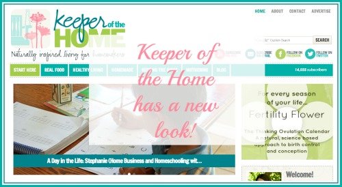
Happy Monday morning and welcome to Keeper of the Home’s newly designed site!
This redesign project has been in the works now for months and I am just a little bit giddy to introduce it to you all to my new blog. Isn’t she pretty? 🙂
Since I know you’ll ask who designed it, the answer is the amazing Joy of Five J’s design. Ever patient with me, she worked diligently until she had made my blog about as beautiful as I could have imagined it would be. Thank you, Joy!
Now, I know things might feel a little bit different around here, but I promise, it’s easy to find your way around here. In fact, a main reason for this redesign was to help make it easier to find the posts and topics that you’re looking for.
Allow me to take you on a bit of a quick visual tour…
(just pretend that all of these cute text bubbles pointing out the new features are me telling you all about it)

What’s new?
We’ve simplified and broken the site down into five main categories…
- real food
- healthy living
- homemade
- keeping the home
- mothering
All the same topics we usually write about, just organized a little bit differently.
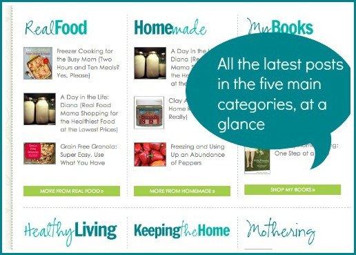
When you’re on the main home page (keeperofthehome.org), you can see the three most recent posts in each of the 5 main categories.
If you haven’t visited for a little while, this makes it simple to catch up and see exactly what’s been on the blog lately.
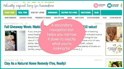
When you click on a category, you’ll be able to see all of the most recent posts in that category.
You’ll also see a secondary menu, which will help you look around and find just what you’re interested in even more easily. For example, the Healthy Living category has the sub-categories:
- Home remedies
- Avoiding Toxins
- Pregnancy & Babies
- Healthy Kids
- Herbs
- Baby Steps
- Cloth Diapering
- PCOS
- Living Healthy
Each of the five main categories has a selection of sub-categories. Some of these will show you all of the most recent posts on that topic.
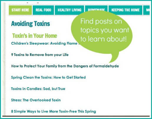
Others will show you a page full of specific links with a TON of links all on that topic.
This will help you find helpful and interesting posts that tend to get buried in the archives.
;

Sometimes you just want to get back to the home page.
So if you’re getting lost in the navigation, you can just click on “HOME” at any time.
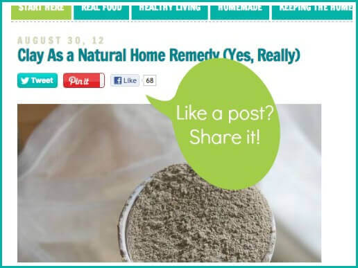
We’ve made it easier for you to pin, tweet or share posts that you love.
You can either share from the top of the bottom of a post (at the bottom, there’s a Stumble button as well).
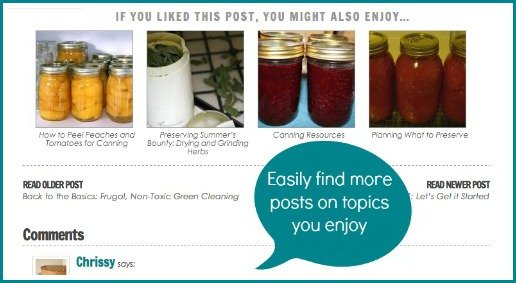
Want to find more posts on similar topics?
Make sure that you check out the related posts widget at the bottom of each post.

It’s common for readers to want to search for a particular search term. Maybe you need a stain remover, or you want a recipe that uses pumpkin in it.
Just use the search bar at the top of the page to see if we have what you’re looking for!
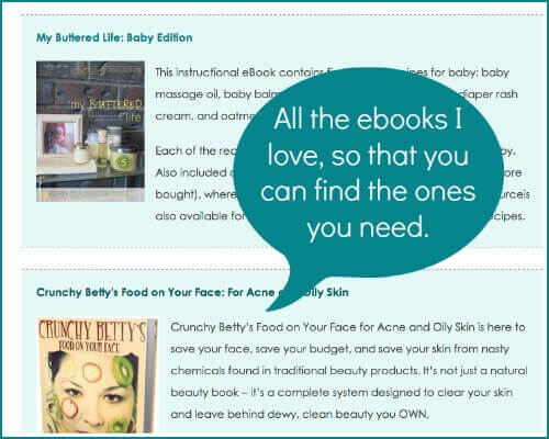
And lastly, we’ve added a resources page. As a blogger, I have the privilege of reading and reviewing so many different eBook and eCourse products. I know that many of you are looking for ways to learn more about healthy living, for recipes to help you in the kitchen or to make our own beauty and cleaning products, etc.
What’s stayed the same?
If you subscribe by email or RSS feed, nothing will change in that regard. The blog will continue to be available in full and for free as it always has been, whether you read it in a blog reader or have it conveniently sent to your inbox.
For those who like to read the blog right on the website itself, you can still do it as you always have. If you love the traditional blog-style page for reading new posts…

…then simply choose Blog and you’ll find all of the most recent posts, from newest to oldest, for you to scroll through without having to click to open anything.
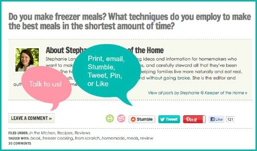
Want to leave a comment? That’s at the bottom of each post, right where it’s always been.
Anything else you’re wondering about? Just ask!
October is Make It Yourself Month
I thought it would be hard to find a blog theme that I have enjoyed more than this “day in the life” series we’ve been writing all through September, but I was wrong. If you love all things handmade, DIY, natural and frugal, then you will LOVE what we have in store for you this month!
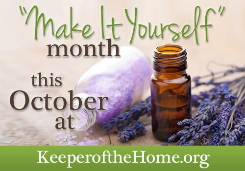
All October will be “Make It Yourself” month. We’ve got posts on beauty and skincare tutorials, herbal home remedies and supplements, cleaning and laundry products, cloth diaper covers, foods you’ve always thought you had to buy, and all sorts of other goodies.
This month is going to so. much. fun. How do I know? Because even in the midst of a crazy busy schedule these last few weeks, I can’t help myself from working on a zillion different homemade experiements. My local natural foods store is probably enjoying my patronage these days as I stock up on ingredients. Just like this new site design, make-it-yourself makes me giddy. Giddy, I tell you!
Shhh… just one more thing.
At the end of October, we have a huge surprise for you.
We’re putting together an AMAZING package of natural living resources that will be available for a phenomenally low price. You will not want to miss it, so stay tuned. 🙂
(I guess it’s not a secret anymore, is it?)

It looks great, Stephanie!! I love the colors! 🙂
Aren’t they fun? I wanted bright and spring-ish and happy. I like happy. 🙂
Looks great! Just curious, why is it not as openly Christian anymore? As in, I believe it used to be “naturally inspired living for the Christian homemaker” or something like that.
Good question. That change doesn’t reflect a change in content, because the things we write about and how open our faith is will stay exactly the same. Also, if you read the About pages, that comes through clearly there as well. The main reason is that we do have a lot of non-Christian readers, particularly ones who find us through Google or through places like Facebook and Pinterest. I don’t want the word “Christian” to be a stumbling bloc to them the moment they land on the blog. I would love for them to stick around longer, read more of the site, get to know us as writers and see our faith come through our posts naturally, rather than being immediately turned off. How can we share the Gospel with them if they don’t stick around long enough to read it? 🙂
Hopefully that answers the question. Basically, the only thing that has changed is that one word being taken out of the title and the site will remain as true to it’s Christian worldview as always!
That makes sense, thanks for clarifying. I was thinking this must be the case and am happy to hear that, but I wanted clarification anyways. I always notice the details LOL 🙂
I love it, Stephanie! It looks amazing!
Thanks, hon!
Love your new site! It’s beautiful and I definitely appreciate the easier navigation.
Looking forward to all of the “make it yourself” posts! And the surprise…
Thanks so much, Alana! And the surprise is a fun one. 🙂
I LOVE it! It’s beautiful, fun, AND useful.
Yay! Glad you like it! 🙂
I love how this is organized. One can get a good sense of the content of the whole blog just from the home page. It’s very user friendly.
I always look forward to seeing Keeper of the Home in my inbox.
I’m so glad to hear that. Helping readers to find content more easily was definitely one of the driving forces behind the redesign project!
I love your new site and how easy it is to navigate now 🙂 And I’m really looking forward to Make it yourself month! So much fun 🙂
Thanks, Jami! 🙂
Looks great! Can’t wait for the “make it yourself” month’s ideas!
Me, too! I’m excited to read all the other writers make it yourself posts!
Love the new look! It looks neat, clean, and beautiful!
So glad you like it!
Lookin’ good, my friend!
Thank you. 🙂
BEAUTIFUL! I love it! The colors perk me up and energize me!
long-time follower by-the-way – HUGE fan 🙂
Aww, thanks so much, April! Love to hear that you like the colors so much! 🙂
love the site redesign, Stephanie! it looks amazing. And the colors are so fresh & happy. Great job – both you and Joy!
Thanks, Emily! Fresh and happy is definitely what I was going for. 🙂
Love the colors!
I love the new look! Its always good to keep things fresh!!!
Wow!!! Love the new site! Absolutely beautiful!